Streamlining navigation for growth
A journey to clarity in Outreach navigation
Imagine walking into a bustling marketplace, but all the signs are faded, the stalls are haphazardly arranged, and no one can tell you where to find what you need. That's what our users experienced with Outreach's navigation.
Years of growth, acquisitions, and feature additions had turned our navigation, and the underlying information architecture, into a tangled web, with obscure icons. Users were lost, frustrated, and, frankly, ready to pack up and leave. We knew we had to act. This wasn't just about fixing a few buttons; it was about rescuing our users from a labyrinth of our own making.

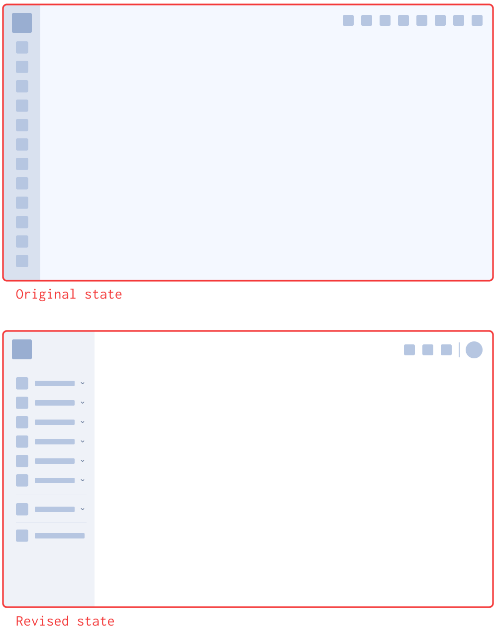
Original state
Outreach’s previous navigation was confusing, cluttered, and difficult to use.
We envisioned a navigation that was not only intuitive and efficient but also a reflection of our brand's evolving story. More than that, we knew that a solid foundation was crucial for Outreach's future. By prioritizing user-centered design, we were setting the stage for sustained growth, ensuring our platform could adapt and scale as we continued to evolve.
As Lead UX Designer, I took on the challenge, leading a six-month initiative to transform our navigation. It was a journey of discovery, collaboration, and relentless focus on the user. Our mission was clear:
To clear the fog: We wanted to streamline navigation, making it easy for users to find what they needed, when they needed it.
To spark joy: We aimed to create a modern, intuitive interface that resonated with our users, reflecting our brand's values and commitment to excellence.
To build a bridge to the future: We designed a scalable system, ensuring our navigation could grow with the platform, adapting to new features and user needs.
The journey wasn't without its twists and turns. We delved into user research, meticulously mapped out user flows, and iterated on prototypes, always keeping the user's perspective at the forefront. Then, the moment of truth arrived: the beta launch.
Early feedback from beta testers and our internal sales team was overwhelmingly positive. They praised the ease of use, the clarity of the new navigation, and the overall platform redesign. It was a testament to the power of user-centered design.
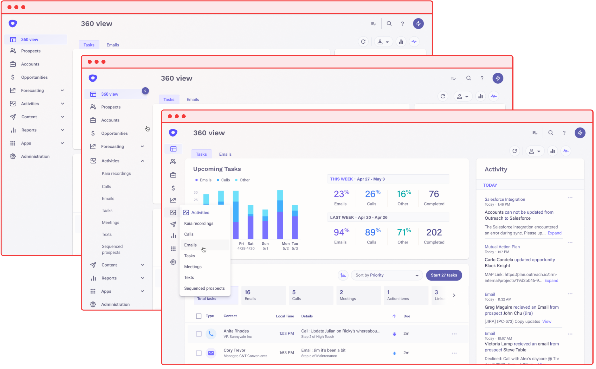
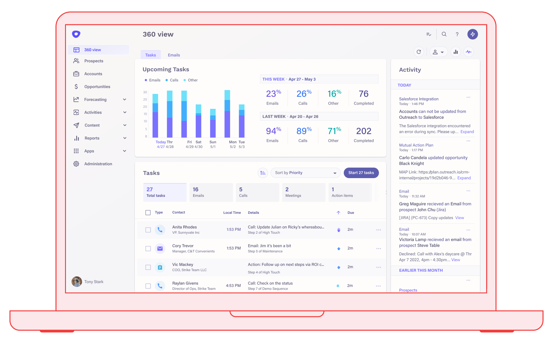
Redesign highlights:
simplified structure
Items are categorized using natural user groupings and functional buckets. Account-level actions are moved to the header, and redundant actions removed.

streamlined global header
Header options are simplified, to showcase only the most essential features. Items are grouped to lessen confusion between actions and pathways.

visual clarity
Icons are optimized for instant recognition and optional labels are shown by default, boosting both readability and user confidence.